
The Hidden Meanings Behind Famous Food Logos You’ve Probably Missed
Most people recognize these food logos instantly. They flash by on wrappers, signs, cups, and packaging so often that they almost disappear into the background of everyday life.
But once you slow down and really look at them, a different layer begins to appear. What seemed like simple branding starts to reveal hidden messages, quiet symbols, and thoughtful details that were there all along.
The Details Hiding in Plain Sight
That is part of what makes strong logo design so memorable. A familiar image can feel straightforward at first glance, yet still carry another meaning that only becomes visible when someone pauses long enough to notice it.
These discoveries can change the way people see brands they have known for years. A quick meal or snack suddenly comes with a visual story tucked into the design.
It is not about changing the food itself. It is about realizing that even the smallest design choices are often made with care, and that a logo can quietly communicate much more than most people expect.
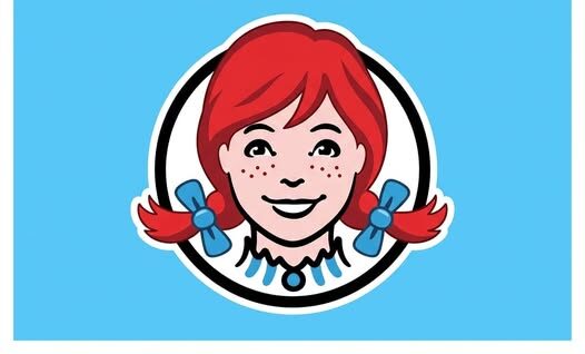
The Word Hidden in Wendy’s Collar
Wendy’s has one of the most recognizable mascots in fast food. The smiling red-haired girl with freckles has been part of the brand’s identity for so long that many people stop noticing the smaller elements around her face.
But one detail stands out when you take a closer look at the ruffled collar beneath her chin. The lines and curves subtly form the word “MOM.”
It is easy to miss because it blends naturally into the design. Nothing about it feels forced or exaggerated, which is probably why it surprises so many people once they finally see it.
That hidden word gives the image a softer meaning. It suggests warmth, familiarity, and the kind of comforting feeling people often connect with home-cooked meals.
Whether someone notices it immediately or only after it is pointed out, the effect is the same. The logo begins to feel less like a simple character and more like a visual nod to comfort and home.
Why That Small Detail Matters
The power of a hidden design element is that it works on two levels. On the surface, the logo still functions exactly as expected, remaining clear, memorable, and easy to recognize from a distance.
At the same time, a second meaning waits underneath for those who look closer. That extra layer can create a stronger emotional connection, even if many people are not consciously aware of it at first.
In Wendy’s case, the hidden “MOM” adds a subtle emotional tone without changing the logo’s familiar appearance. It is a quiet design move, but one that gives the brand image added depth.
The Motion Built Into Subway’s Logo
Subway’s logo is another example of a design that says more than it appears to say. At first, most people simply see the brand name in bold lettering, something clean and direct for a company built around quick service.
But the arrows built into the logo tell a more complete story. One points one way, and the other points the opposite direction.
That simple contrast creates a sense of motion. It suggests people arriving and leaving, moving through spaces, making choices, and continuing on with the pace of daily life.
The design echoes the energy of a subway station, where movement is constant and direction is always part of the experience. That makes the logo feel more connected to the brand name itself.
Instead of just presenting a word, the design reinforces an idea. It turns the logo into a visual expression of flow, speed, and the everyday rhythm of grabbing something to eat while life keeps moving.
A Sense of Choice and Everyday Motion
The arrows also hint at decision-making. A person can go one way or another, choose one route or the next, and keep moving forward.
That fits naturally with the fast, practical nature of a sandwich stop during a busy day. The logo reflects the feeling of people coming in, ordering, and heading back out into the rush around them.
It is a simple idea, yet it becomes far more interesting once it is noticed. What first looked like ordinary lettering suddenly feels much more intentional.
That is part of what makes hidden logo details so memorable. Once people see them, it becomes difficult to unsee them.
The Bear Hidden in Toblerone’s Mountain
Toblerone’s packaging offers another example of a hidden symbol placed inside a familiar design. Most people recognize the mountain shape right away, since it has long been one of the brand’s signature visual elements.
At a glance, it appears to be exactly what it looks like: a mountain silhouette used as a bold and simple emblem. But inside that mountain is the outline of a bear.
The hidden bear is a tribute to Bern, Switzerland, the chocolate bar’s birthplace. Bern is known as the “City of Bears,” and that identity is quietly worked into the logo.
This kind of design choice turns the packaging into more than a recognizable wrapper. It becomes a subtle connection to origin, place, and identity.
The image still works perfectly well for people who never notice the bear. But for those who do, the logo suddenly feels richer and more personal.
When Branding Carries a Place With It
One of the most effective things a logo can do is communicate a sense of story without needing extra explanation. A single hidden image can suggest history, location, or tradition in a way that feels effortless.
In Toblerone’s case, the mountain alone already gives the brand a distinct look. Adding the hidden bear creates another level of meaning tied to where it comes from.
That extra detail does not overwhelm the design. Instead, it rewards attention.
People often enjoy discovering something that was there all along, especially when it feels clever rather than obvious. The hidden bear does exactly that, making the logo feel more deliberate and memorable.
Why Hidden Logos Fascinate People
There is something satisfying about finding a secret in something familiar. It creates the feeling that a common object has suddenly become more interesting than it seemed a moment earlier.
Food branding is especially powerful in this way because people interact with it so often. Wrappers, menus, containers, and signs become part of routine life, which makes it easy to overlook the design work behind them.
That routine is exactly why these hidden details have such impact. They are sitting in plain sight, waiting to be noticed during an ordinary moment.
A burger wrapper, a sandwich shop sign, or a chocolate bar package may seem too familiar to surprise anyone. Yet those are often the very places where design can hide its smartest ideas.
More Than Packaging and Paper
Once these hidden features are noticed, the experience of seeing the brand changes. A logo no longer feels like background decoration.
Instead, it begins to feel like a small conversation between the brand and the viewer. A wink. A clue. A detail placed there for anyone curious enough to look twice.
The food itself stays the same, but the packaging becomes more than a wrapper. It starts to carry personality, memory, and intention.
That shift can make an everyday purchase feel unexpectedly thoughtful. Even a quick stop for a familiar meal can come with a sense of discovery.
The Stories We Miss in Everyday Design
Many people move through daily life without ever studying the symbols around them. That is understandable, since logos are built to work quickly, often in just a passing glance.
But some of the best designs are built for both speed and depth. They do their job instantly while still leaving room for a second meaning to unfold over time.
That is what makes these food logos so fascinating once their hidden elements are revealed. They show how much meaning can live inside even the most familiar designs.
A collar can spell “MOM.” A pair of arrows can suggest movement and direction. A mountain can conceal a bear and quietly point back to a city’s identity.
Seeing Familiar Brands in a New Way
After noticing these details, it becomes harder to look at these logos the same way again. What once felt ordinary starts to seem carefully constructed, layered, and full of intention.
That change in perspective is part of the appeal. People enjoy the feeling of discovering that something common still has the power to surprise them.
It also explains why hidden logo meanings spread so quickly once they are shared. The reaction is almost always the same: surprise first, then a second look, then the realization that the clue had been visible the entire time.
These details may be small, but they leave a lasting impression. They remind people that design is not only about appearance. It is also about story, feeling, and the quiet messages placed inside ordinary things.
A Closer Look at the Familiar
The next time you unwrap a meal or pick up a familiar snack, the logo may not feel quite so simple. Those colors, shapes, and lines might hold more than brand recognition.
They may carry hidden references to comfort, motion, place, or identity. They may turn an everyday object into something a little more layered and memorable.
That is what makes these designs so effective. They do not need to announce their secrets loudly.
They simply wait in plain sight until someone finally notices them. And once that happens, even the most routine bite can come wrapped in a story.