
Hidden Messages in Famous Logos: 10 Surprising Details You’ve Probably Never Noticed
From the Word Hidden in Wendy’s Collar to the Bear Inside Toblerone’s Mountain, Some of the World’s Most Familiar Logos Contain Details That Change How You See Them Forever.
You’ve probably seen these logos thousands of times.
On restaurant signs, delivery trucks, chocolate wrappers, shopping bags, television commercials, and websites.
They’re so familiar that most of us barely notice them anymore.
But what if some of the most recognizable logos in the world contained details you’ve been overlooking for years?
A word that seems to appear inside a little girl’s collar.
An arrow hiding between two ordinary letters.
A bear standing inside a mountain.
And a number concealed within the initials of an ice cream company.
These details are examples of how designers use shapes, colors, typography, and empty space to create memorable visual identities.
Some were deliberately placed there.
Others were discovered by observant viewers long after the logos were introduced.
And a few have inspired theories that are far more dramatic than the evidence supports.
But whether intentional or accidental, they reveal something fascinating about the way our brains interpret familiar images.
Once you notice certain details, it can become surprisingly difficult to stop seeing them.
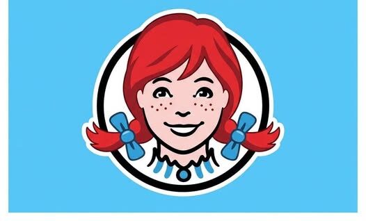
1. Wendy’s: The Word “MOM” Hidden in the Collar
At first glance, the Wendy’s logo looks straightforward.
It features a smiling red-haired girl with freckles, pigtails, and a blue-and-white striped collar.
The character is based on Melinda Lou Thomas, the daughter of Wendy’s founder Dave Thomas, whose nickname inspired the restaurant’s name.
But take a closer look at the girl’s collar.
Many people believe the folds and decorative lines appear to form three letters.
M-O-M.
When the observation gained attention online in 2013, some people suggested that the word had been deliberately incorporated into the design.
The theory was appealing.
After all, a fast-food restaurant might benefit from associations with family, comfort, and home cooking.
But Wendy’s offered a different explanation.
A company spokesperson confirmed that the resemblance was unintentional.
The collar was not designed as a secret message about mothers.
Nevertheless, the interpretation became one of the internet’s most widely discussed examples of hidden imagery in branding.
And it demonstrates an interesting psychological phenomenon.
Once someone points out a familiar word inside an abstract pattern, the brain may begin recognizing it automatically.
Even if the resemblance was accidental.
2. Subway: The Arrows Most People Never Question
Subway’s logo is another familiar sight.
Its green-and-yellow lettering has appeared on storefronts, food packaging, and advertisements around the world.
But the letters contain an unusual design feature.
The first and last letters incorporate arrows pointing in opposite directions.
The arrows have long been associated with the idea of movement and entry and exit.
They also make the lettering distinctive.
When Subway introduced a refreshed logo and standalone symbol in 2016, the company provided an explanation for its use of arrows.
According to Subway, the arrows in the updated symbol represent the choices available to customers.
That meaning fits the company’s made-to-order approach to sandwiches.
Customers select their bread, fillings, vegetables, and other ingredients.
Rather than communicating a complicated message through words, the arrows help create a recognizable symbol associated with the brand.
And because they are integrated into the lettering, many customers may notice them without consciously thinking about their meaning.
3. Toblerone: The Bear Hiding Inside the Mountain
For years, Toblerone chocolate packaging featured one of the most recognizable mountain illustrations in the world.
The image represented the Matterhorn, the famous Alpine peak associated with Switzerland.
But hidden within the mountain’s light and dark shapes was another figure.
A standing bear.
Once you know where to look, the silhouette becomes much easier to recognize.
The bear was a reference to Bern, the Swiss city where Toblerone originated.
Bern has a longstanding cultural association with bears, which appear in its coat of arms and local traditions.
That made the hidden animal a meaningful reference to the chocolate brand’s origins.
However, there is an important historical detail.
In 2023, Toblerone began replacing the Matterhorn illustration on certain packaging with a more generalized mountain design.
The change followed a decision to move some production outside Switzerland and the resulting need to comply with Swiss rules governing national imagery and origin claims.
That means the famous bear-in-the-Matterhorn design is best understood as part of Toblerone’s historical branding, rather than something guaranteed to appear on every current wrapper.
Even so, it remains one of the best-known examples of a meaningful symbol hidden inside a larger illustration.
4. FedEx: The Arrow Between Two Letters
Perhaps the most celebrated example of hidden imagery in logo design belongs to FedEx.
At first glance, the company’s logo appears to be nothing more than its name written in bold lettering.
But look closely at the space between the capital E and the lowercase x.
You’ll discover a white arrow pointing to the right.
The arrow is formed entirely by the negative space between the letters.
It doesn’t require an additional illustration.
Instead, the surrounding shapes create the symbol.
The design is widely associated with speed, movement, direction, and precision.
These qualities are particularly relevant to a company specializing in transportation and delivery.
What makes the FedEx arrow remarkable is how naturally it fits into the wordmark.
Someone who has never noticed the arrow can still recognize the logo immediately.
But once the hidden shape becomes visible, it adds another layer of meaning.
That is one reason the FedEx logo is frequently discussed in graphic design education.
5. Amazon: A Smile That Also Connects A to Z
Amazon’s logo features the company’s name with a curved orange arrow underneath.
Many people see the arrow as a smile.
And that interpretation is consistent with the brand’s friendly visual presentation.
But the arrow also connects two specific letters.
It begins beneath the A and points toward the Z.
The connection represents the idea of offering products from A to Z.
In other words, an enormous range of merchandise.
It’s a simple design decision that communicates two ideas simultaneously.
The curved shape suggests friendliness and satisfaction.
The connection between letters suggests variety.
Neither message requires a lengthy slogan.
And because the arrow is so simple, it can be recognized even when the complete company name is absent.
6. Baskin-Robbins: The Number 31 Hidden in Plain Sight
Baskin-Robbins has long been associated with its famous 31 flavors concept.
The idea originally emphasized that customers could enjoy a different ice cream flavor on every day of a 31-day month.
For years, the company incorporated that number into its visual identity.
In a familiar version of the logo, the pink sections of the letters B and R form the number 31.
The detail is easy to overlook because the eye naturally reads the two large letters first.
But once someone identifies the number, the design becomes much more interesting.
It connects the company’s initials to one of its best-known marketing traditions.
Unlike Wendy’s apparent MOM message, the 31 in Baskin-Robbins’ branding is intentional.
It is an example of how typography can communicate a brand’s history without adding a separate illustration.
7. Toyota: More Than Three Overlapping Ovals
Toyota’s emblem appears simple.
Three overlapping ovals form a balanced, symmetrical symbol.
But the company has explained that the design carries several meanings.
The two inner ovals symbolize the relationship between the customer and the company.
The outer oval represents the world embracing Toyota.
The design also allows viewers to identify the letter T.
Some people have gone further, demonstrating how the shapes can be interpreted as containing the letters of the entire Toyota name.
That is a popular visual exercise, although it should not be confused with the company’s primary explanation of the emblem.
The important point is that the logo was created to communicate a recognizable identity through simple geometry.
It is memorable because the shapes remain clear even at small sizes.
8. Hyundai: A Letter That Also Resembles a Handshake
The Hyundai emblem initially appears to be a slanted letter H.
But the company has also described the shape as representing two people shaking hands.
One figure symbolizes the company.
The other represents the customer.
The handshake is intended to suggest trust, partnership, and a positive relationship.
The slanted shape gives the symbol a sense of motion.
What looks like a simple initial therefore carries a second visual interpretation.
It is a useful example of how brands can build an additional idea into a familiar letterform.
9. LG: A Human Face Hidden Inside Two Letters
The LG logo consists of a circular red emblem containing stylized versions of the letters L and G.
But viewed another way, the shapes resemble a human face.
The small circle becomes an eye.
The L suggests a nose.
And the surrounding curved form helps complete the impression.
LG has associated its emblem with a human-centered brand identity.
The face gives the otherwise geometric symbol a friendly quality.
This is an example of how even a minimal design can create an emotional impression.
Instead of showing a detailed human portrait, the logo uses a few simple shapes to suggest a recognizable expression.
10. The Carrefour Logo: A Letter Hidden Between Two Arrows
The French retail company Carrefour uses a distinctive red, white, and blue emblem.
At first glance, the design looks like two arrows pointing in opposite directions.
But the white space between the colored shapes forms the letter C.
The letter refers to Carrefour’s name.
It is a classic example of negative-space design.
The viewer’s attention is initially drawn to the colored sections.
But the most meaningful shape appears in the empty area between them.
That makes the logo especially memorable once the hidden letter has been recognized.
Why Does Your Brain Miss These Hidden Details?
One of the most interesting aspects of logo design is how differently people can interpret the same image.
Someone may look at the FedEx logo for years without seeing the arrow.
Another person might recognize it almost immediately.
The difference has much to do with visual perception.
Our brains constantly organize shapes, patterns, colors, and spaces into recognizable objects.
In psychology, this process is often discussed through principles of Gestalt perception.
These principles help explain why people naturally group visual elements and interpret them as complete forms.
For example, when looking at the FedEx logo, the brain typically focuses on the letters.
The white area between them is treated as background.
But when someone points out the arrow, that same background suddenly becomes a meaningful shape.
Nothing about the image has changed.
Only the viewer’s interpretation has changed.
What Is Negative Space in Logo Design?
Negative space is the area surrounding or between the main elements of a design.
It may appear empty, but designers can use it to create additional shapes and meanings.
The FedEx arrow is one of the clearest examples.
The Carrefour letter C is another.
In both cases, the hidden symbol exists because of the relationship between the surrounding shapes.
Negative space can make a design more interesting without adding visual clutter.
It also rewards closer attention.
A logo can remain simple and readable while containing a second image that viewers discover later.
Are Hidden Logo Messages a Form of Subliminal Advertising?
The idea of hidden messages often leads to questions about subliminal advertising.
Some online discussions suggest that companies secretly place symbols in logos to influence consumers without their knowledge.
But it is important to distinguish several different things.
A deliberately designed symbol is not automatically a subliminal message.
The FedEx arrow, for example, is a visible graphic element that people can recognize once they know where to look.
Likewise, the Baskin-Robbins number 31 is an intentional reference to the company’s history.
Neither requires an assumption that consumers are being secretly controlled.
And Wendy’s apparent MOM message shows why caution matters.
Although many people interpreted the collar as a hidden emotional cue, the company stated that the resemblance was accidental.
It would therefore be misleading to present that interpretation as proof of a deliberate psychological strategy.
Good branding can influence recognition, associations, and preferences.
But claims that a hidden image can bypass skepticism or compel people to buy something require evidence beyond the mere existence of a visual pattern.
Why Brands Invest So Much in Simple Symbols
Modern consumers encounter enormous numbers of visual messages.
Advertisements appear on phones, television screens, billboards, packaging, and social media feeds.
In that environment, brands benefit from designs that are easy to recognize.
A strong logo needs to work quickly.
It should remain recognizable at different sizes.
It should function across different media.
And ideally, it should create associations that support the brand’s identity.
For a delivery company, an arrow can suggest movement.
For an ice cream company, a number can reference a memorable product tradition.
For a chocolate brand, a local animal can connect the product to its geographic origins.
These visual details can make a logo distinctive without requiring complicated explanations.
The Difference Between a Hidden Meaning and a Coincidence
Not every unusual shape inside a logo was placed there intentionally.
Human beings are remarkably good at finding recognizable patterns.
We see faces in clouds.
Animals in rock formations.
And letters in decorative shapes.
This tendency is sometimes described as pareidolia.
It helps explain why people may discover apparent messages in images that were never intended to contain them.
The Wendy’s collar is a useful reminder.
The letters many viewers recognize are real as a visual interpretation.
But the company’s explanation indicates that the resemblance was not deliberately created.
That distinction matters.
A surprising interpretation can be interesting without being evidence of a secret plan.
How to Start Noticing Hidden Details in Everyday Logos
Once you understand the basic techniques, you may begin noticing familiar logos differently.
Instead of looking only at the company name, examine the spaces between the letters.
Pay attention to curves, angles, and overlapping shapes.
Look for numbers or initials created by contrasting colors.
Consider whether an illustration contains a second recognizable image.
And ask whether the design references the company’s name, history, products, or geographic origins.
Most importantly, separate what you can see from what you can prove about the designer’s intentions.
Sometimes a company has publicly explained the symbolism.
Sometimes a designer has discussed the creative process.
And sometimes a popular interpretation remains nothing more than an intriguing possibility.
What These Famous Logos Reveal About the Power of Design
The most interesting lesson is not that every company is hiding a secret.
It is that a small visual detail can carry an extraordinary amount of meaning.
A white arrow can suggest movement.
A bear can connect a chocolate bar to a Swiss city.
A number can preserve a company’s decades-old marketing tradition.
And an accidental resemblance can become so widely recognized that it becomes part of a brand’s popular history.
These examples demonstrate the creativity involved in graphic design.
They also show why familiar images can become more interesting when we slow down and examine them carefully.
For many viewers, the discovery itself is the memorable part.
After seeing the FedEx arrow, they may never look at the company’s lettering in quite the same way.
After discovering the Toblerone bear, the old mountain illustration becomes something more than a picture of an Alpine peak.
And after recognizing the number 31 inside Baskin-Robbins’ initials, a familiar restaurant sign suddenly tells a little piece of the company’s history.
You’ll Never Look at These Logos Quite the Same Way Again
The next time you pass a Wendy’s restaurant, notice the girl’s collar.
When you see a FedEx truck, look between the E and the x.
When you encounter the classic Toblerone mountain design, search for the bear.
And when you see the familiar Baskin-Robbins lettering, look for the number hidden within it.
Some of these details were carefully planned.
Others became famous because people discovered meanings the companies hadn’t intended.
But together, they demonstrate how much visual information can exist inside an image we think we already understand.
Perhaps the biggest surprise isn’t that familiar logos contain hidden details. It’s that we can look at something thousands of times and still discover something new.
And now that you know where to look, the logos around you may never seem quite as ordinary again.