
Why the Lay’s Logo Remains One of the Most Recognizable Brand Designs
A Familiar Design With Lasting Appeal
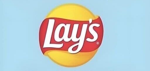
The Lay’s logo is one of the most recognizable visual identities in everyday consumer life. Its design brings together a bright golden-yellow circle, a sweeping red ribbon, and the brand name placed prominently at the center.
That combination creates an immediate sense of familiarity. It is a logo many people can identify in a moment, whether they see it in a supermarket aisle, a vending machine, or an advertisement.
Its impact comes from more than simple visibility. The design works because it communicates a mood as well as a product, suggesting comfort, enjoyment, and an easy moment of relaxation.
Over time, the logo has become connected not just to a snack, but to ordinary experiences people share with friends, family, or during a break in the day. That emotional connection is part of what gives the image such staying power.
The design also avoids extremes. It feels cheerful without becoming overly loud, and familiar without seeming old-fashioned.
That balance has helped it remain effective even as broader design trends have changed. While visual styles in branding continue to shift, the Lay’s logo has held onto a strong and stable identity.
From a Small Beginning to Global Recognition
The history behind the brand begins with Herman Lay, whose vision in 1932 helped turn a small snack business into a name known around the world. As the company grew, its visual presentation also had to evolve.
At first, the brand identity was tied more closely to packaging alone. But as recognition became more important, the logo took on a larger role in shaping how the company was seen.
It became more than a label on a bag. It served as a symbol that could communicate the brand’s character quickly and clearly.
That role required careful development. The logo needed to appear welcoming, dependable, and enjoyable, so that it would reflect the qualities people associated with the product.
As years passed, changes to the design did not attempt to erase the past. Instead, each update worked to refine the image while preserving the core features that people already recognized.
This gradual approach helped the logo stay modern without losing its identity. It allowed the brand to grow while keeping a visual connection to its earlier history.
That continuity matters in consumer design. When people repeatedly encounter a familiar symbol that remains consistent over time, it can strengthen trust and reinforce recognition.
In that way, the evolution of the Lay’s logo reflects a broader understanding of how branding shapes perception. Each redesign served to sharpen what was already there rather than replace it entirely.
The Meaning Behind the Yellow Circle
One of the most important features of the Lay’s logo is the bright yellow circle that forms the background of the central design. It acts as a visual anchor and gives the logo a strong, simple structure.
The color choice carries a direct association with the product itself. The yellow tone calls to mind the golden color of potato chips, creating an immediate link between the visual identity and what the brand sells.
That connection is effective because it feels natural. Without needing to show the product directly, the color suggests it in a way the viewer can understand almost instantly.
Yellow also has emotional value in design. It is often associated with warmth, happiness, energy, and positivity, all of which suit a brand built around enjoyment and casual snacking.
The circular shape adds to that effect. A circle can suggest wholeness, comfort, and completeness, which gives the logo a welcoming appearance.
Rather than feeling sharp or rigid, the round form feels soft and approachable. That makes the design easier to connect with on an emotional level.
In many versions of the logo, the circle also includes a subtle shine. This detail gives the yellow area a fresher, more vibrant appearance and prevents it from feeling flat.
The result is a shape that appears lively and full of energy. Even as a simple background element, it contributes heavily to the logo’s ability to attract attention and hold it.
These visual choices are effective because they align with the product experience the brand wants to suggest. The yellow circle helps communicate pleasure, comfort, and a lighthearted sense of satisfaction.
The Role of the Red Ribbon
Crossing the yellow circle is the logo’s distinctive red ribbon. This element adds contrast, structure, and a sense of movement to the overall design.
Red is known for being eye-catching. It naturally draws attention and creates strong visual energy, which makes it especially useful in a crowded retail environment.
In this logo, however, the red does not feel harsh. The curved ribbon softens the intensity of the color, making it feel inviting rather than aggressive.
That curved line helps guide the eye across the logo. Instead of presenting the design as a static block, it introduces motion and gives the composition more life.
The ribbon also creates a layered effect. It prevents the logo from appearing overly flat and adds a sense of depth that makes the design more dynamic.
This movement can also be understood in a symbolic way. The flowing shape suggests ease and continuity, which fits the brand’s approachable and familiar image.
Some readings of the design connect the ribbon to a sense of tradition. Its form echoes older stylistic choices while still fitting comfortably within a modern brand identity.
Whether viewed as a visual accent or as a more meaningful feature, the ribbon plays an essential role. It helps balance the composition and strengthens the logo’s energetic but welcoming personality.
Without it, the design would lose much of its contrast and rhythm. The red ribbon is not simply decorative; it is central to how the logo communicates its identity.
Typography That Feels Friendly and Clear
The lettering in the Lay’s logo contributes just as much to its success as the colors and shapes around it. The type has a rounded, slightly tilted appearance that makes it feel informal and approachable.
That style fits the product well. A snack brand benefits from a look that feels relaxed and friendly rather than rigid or overly formal.
The typography supports that impression by adding a human touch. It suggests spontaneity, ease, and accessibility, all of which align with the idea of casual enjoyment.
The white text stands out strongly against the warmer colors behind it. This contrast helps the brand name remain easy to read even at a distance or in visually busy environments.
Clarity is especially important in a logo that appears across many settings. A design that can be recognized quickly in different sizes and conditions has a clear practical advantage.
The spacing between the letters also matters. Because the word does not feel crowded, the name remains open and legible, which adds to the overall simplicity of the design.
The letters work together with the surrounding curves to create a cohesive visual identity. Nothing feels disconnected or forced.
There is also a subtle visual suggestion built into the overall arrangement. The combination of the rounded forms and curved structure gives the logo a shape that can faintly resemble a potato chip.
That resemblance is not literal, yet it is effective. It allows the design to connect with the product on a subconscious level without needing to show the item directly.
This is one reason the logo feels so unified. The typography is not just a name placed on top of a symbol; it is part of a larger design language that supports recognition and meaning.
Why the Logo Continues to Work
The strength of the Lay’s logo lies in its ability to combine simplicity with emotional meaning. It is easy to recognize, but it also carries a sense of warmth and enjoyment that goes beyond function.
That combination gives the design unusual durability. A logo does not remain effective for decades by being noticeable alone; it also has to remain meaningful and adaptable.
Lay’s has managed that by keeping the core identity intact while making careful refinements over time. The result is a visual symbol that still feels current without losing the familiarity people expect.
Its broad appeal has also helped it cross language and cultural boundaries. The design communicates through color, shape, and tone, allowing it to be recognized widely and easily.
That kind of recognition is powerful. It shows how a simple arrangement of forms can come to represent shared experiences, comfort, and everyday enjoyment.
The logo reflects the product, but it also reflects the feeling associated with it. It suggests a brief pause, a casual gathering, or a small moment of pleasure built into daily life.
That is why the design continues to stand out. It does not rely on complexity to make an impression.
Instead, it demonstrates how thoughtful visual choices can create a brand image that is both memorable and emotionally resonant. Even after many years of evolution, the logo still delivers the same essential message through one familiar and enduring design.