
Hidden Messages in Famous Logos Show How Quietly Brands Shape What People Notice
The Silent Language Behind Familiar Symbols
The logos people see every day often appear simple, friendly, and familiar. They sit on storefronts, food packaging, billboards, phone screens, delivery bags, and shopping receipts without demanding much attention.
Yet many of these designs are not as simple as they seem. Behind the colors, letters, shapes, and empty spaces, there are quiet visual choices meant to guide emotion before a person consciously understands what they are seeing.
A logo can suggest comfort, movement, trust, memory, pride, or belonging in less than a second. That is why some of the most recognizable brand symbols are built not only to identify a company, but also to create an immediate feeling.
The effect is subtle. The message is rarely spoken directly. Instead, it is placed inside the design itself, where the eye may pass over it while the brain still receives it.
How Logos Speak Before Words Do
Modern branding does not rely only on names or slogans. It often depends on visual shortcuts that work faster than language.
When a person looks at a logo, the brain quickly processes color, direction, contrast, symmetry, and shape. This happens almost instantly, long before anyone stops to analyze the image.
That speed gives logos their power. A small curve, a hidden figure, or a carefully arranged letter can influence whether a brand feels warm, energetic, traditional, playful, or trustworthy.
The viewer may believe they are simply recognizing a familiar company. In reality, the design may already be shaping an emotional response.
This is why hidden symbols can be so effective. They do not need to be obvious to work. Sometimes their strength comes from remaining just beneath the surface.
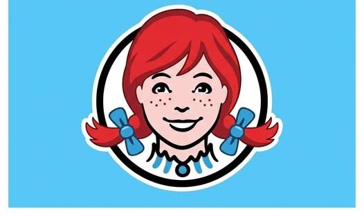
The Wendy’s Collar and the Feeling of Home
One of the most discussed examples is the Wendy’s logo. Many people have noticed that the collar in the image appears to spell MOM.
Whether seen immediately or only after someone points it out, the detail changes how many people view the design. A fast-food logo suddenly begins to feel connected to home, care, and familiar meals.
The image already presents a friendly character, but the hidden word adds another emotional layer. It quietly connects the brand with a sense of comfort that many customers associate with family and childhood.
That kind of design choice does not need to be loud. It works because it feels soft, ordinary, and almost accidental.
Once noticed, however, it becomes difficult to ignore. The collar is no longer only part of an outfit. It becomes a small emotional signal hidden in plain sight.
Subway’s Arrows and the Suggestion of Motion
Subway offers another familiar example through the arrows built into its lettering. The letters appear to point in opposite directions, creating a sense of movement and forward energy.
That visual motion fits the experience the brand wants to suggest. It points to speed, direction, travel, and a quick stop between one place and another.
The arrows do not require explanation. A customer does not need to study the logo to understand the feeling it creates.
The design quietly tells the eye that this is a brand connected to movement. It suggests that people can come in, choose quickly, and continue on their way.
In that sense, the logo becomes more than a name. It becomes a small visual instruction.
The Toblerone Mountain and the Bear in the Shape
The Toblerone logo is often remembered for its mountain shape. At first glance, it looks like a bold image of a peak, tying the chocolate to place, tradition, and a sense of origin.
Inside that mountain, however, many viewers eventually notice the shape of a bear. The hidden figure gives the logo a second meaning and turns a simple mountain into a visual puzzle.
This detail rewards closer attention. It makes the logo feel more memorable because the viewer experiences a small moment of discovery.
That moment matters. People tend to remember images more strongly when they feel they have uncovered something themselves.
The hidden bear adds identity, pride, and character without needing extra words. It is a quiet symbol inside a larger symbol.
Why Hidden Details Stay in Memory
Hidden symbols work because they create a small emotional reward. When people finally notice them, they often feel surprise, amusement, or curiosity.
That reaction makes the design more memorable. A logo that once seemed ordinary becomes a story someone can share with another person.
This is part of the power of visual branding. The message does not end when the logo is seen. It continues when someone says they never noticed the hidden detail before.
That shared discovery turns the logo into conversation. It gives the brand more time inside the viewer’s mind without needing a new advertisement.
In a crowded world of images, even a brief moment of extra attention can be valuable.
The Designed World Around Everyday Life
People often move through stores, streets, apps, and websites as if the visual world around them is neutral. But much of what they see has been carefully arranged.
Every aisle, billboard, package, and screen can carry choices about color, shape, spacing, and emotional tone. These choices are not random decoration.
They are part of a designed environment that encourages people to feel certain things before they make decisions.
A soft curve may feel friendly. A sharp angle may feel fast or bold. A warm color may feel comforting. An arrow may suggest action.
These details may seem small on their own, but together they create a visual language that surrounds daily life.
Emotional Shortcuts Built Into Design
The most successful logos often act as emotional shortcuts. They compress a brand’s identity into a form that can be understood almost instantly.
This is why a logo does not need to explain everything about a company. It only needs to create the right first impression.
A hidden word such as MOM can suggest warmth. Arrows can suggest speed. A bear hidden inside a mountain can suggest heritage and personality.
Each example shows how meaning can be layered into a design without making the logo feel crowded or complicated.
The viewer may not consciously read every layer, but the overall feeling still lands.
When Persuasion Becomes Invisible
The unsettling part of hidden logo design is how quietly it can work. People may believe they are responding only to a product, price, or habit.
But visual signals can influence memory and feeling before a practical decision is made. This does not mean every viewer reacts the same way, but it does show how carefully brands try to reduce resistance.
A familiar logo can feel safe because it has appeared many times before. A hidden symbol can deepen that comfort by adding emotional meaning beneath the surface.
That is why these designs can feel like whispers rather than statements. They do not argue with the viewer. They simply wait to be absorbed.
The persuasion is not always aggressive. Often, it is quiet enough to feel natural.
The Human Hand Behind the Illusion
There is also a more hopeful way to look at these hidden messages. Each symbol shows that someone made deliberate creative choices.
A logo is not only a corporate mark. It is also the result of human decisions about meaning, memory, and visual storytelling.
Someone considered how a collar might be read, how arrows could live inside letters, or how a bear could be tucked into a mountain.
Those choices show that design is a form of communication. Even when it is used to sell, it still reveals creativity and intention.
The hidden message is not only a trick. It is also evidence that images can carry stories quietly and efficiently.
Learning to Read Negative Space
Once people begin noticing these details, they often start seeing logos differently. Empty space no longer feels empty.
Negative space can hide shapes, symbols, movement, and meaning. A gap between letters can become an arrow. A patch inside an image can become an animal. A small detail in clothing can become a word.
This kind of noticing changes the relationship between viewer and brand. The person is no longer only receiving the image passively.
They begin to read it. They begin to ask what is being suggested, what feeling is being encouraged, and what message is being placed below the obvious one.
That awareness does not remove the power of branding, but it does make the viewer less defenseless against it.
From Target to Translator
The biggest shift happens when a person slows down. Instead of letting every image pass unnoticed, they begin to translate what is in front of them.
They may still enjoy the logo. They may still buy the product. But they are doing so with more awareness of the emotional design behind it.
This matters because the modern visual world is crowded with persuasion. Screens, stores, roads, and social feeds are filled with symbols competing for attention.
Learning to decode those symbols gives people a small measure of control. It allows them to decide which messages deserve space in their memory.
The logo may still speak first, but the viewer can answer back with awareness.
Why These Symbols Are Hard to Unsee
Hidden logo details often become unforgettable after they are discovered. A person who sees the MOM shape, the Subway arrows, or the Toblerone bear may never look at those logos the same way again.
That permanence is part of their effectiveness. The discovery changes an ordinary brand image into something with a second layer.
The design becomes a small secret shared between the logo and the viewer. Once revealed, it remains attached to the brand.
That is why hidden symbols are so valuable in branding. They give familiar images renewed attention and make them feel more personal.
The viewer may have passed the logo hundreds of times before. But after noticing the hidden detail, the image feels newly active.
The Power of Seeing More Clearly
The world of logos is not a neutral collection of colors and shapes. It is a carefully designed space filled with emotional cues, subtle signals, and hidden meanings.
Wendy’s, Subway, and Toblerone show how familiar brands can place quiet messages inside ordinary designs. These details may look small, but they can shape how people remember and feel about a company.
The real lesson is not simply that famous logos contain secrets. It is that visual persuasion often works best when it feels invisible.
By learning to notice the hidden words, arrows, animals, curves, and spaces, people become more conscious of the messages surrounding them.
They stop being only targets of design and become translators of it. In that awareness, there is a small but meaningful kind of power.