
The Hidden Smile People Say They See Inside the Coca-Cola Logo
The Coca-Cola logo is one of the most recognizable brand marks in the world, but a small detail inside it has recently changed the way many people look at it.
For years, most people have seen the familiar red-and-white script simply as a classic piece of branding. The flowing letters feel old-fashioned, polished, and instantly familiar.
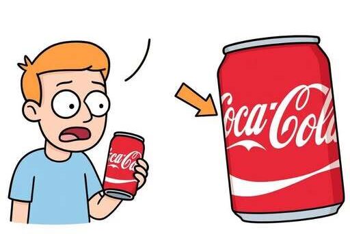
But once someone points to the second “C” in “Cola,” the logo can suddenly appear different. What once looked like an ordinary curve may begin to resemble something warmer and more human.
A Familiar Logo With a New Detail
The detail attracting attention is not a new design element or a recent change. It has been sitting inside the logo the entire time, visible to anyone who takes a closer look.
The second “C” in “Cola” has a rounded shape and open curve that some people now interpret as a small smile. After noticing it, many find it difficult to return to seeing the letter as just a letter.
That reaction is part of what makes the observation so interesting. The logo itself has not changed, but the viewer’s perception of it has.
A simple curve becomes expressive. A piece of typography begins to feel like a face. A brand mark that has existed in public view for generations suddenly seems to carry an emotional detail hidden in plain sight.
Why the Detail Feels So Memorable
The idea of a hidden smile appeals to people because it gives a familiar object a new layer of meaning. The Coca-Cola logo is already associated with friendliness, refreshment, and nostalgia, so the possible smile feels consistent with the mood many people connect to the brand.
That does not mean every viewer will see it the same way. Some will immediately recognize the smile-like shape, while others may see only a stylized letter.
Still, the observation has a powerful effect because it creates a before-and-after moment. Before seeing it, the logo is just a logo. After seeing it, the eye keeps returning to the same curve.
This is why the reaction can feel so strong. The design does not need to be obvious to be memorable. Sometimes a tiny visual detail becomes more powerful because it feels discovered rather than announced.
A Smile or a Coincidence?
The central question is whether the shape was meant to be a hidden smile or whether people are simply finding meaning in a familiar design.
The logo’s script style naturally contains curves, loops, and flowing strokes. In that kind of lettering, it is easy for certain shapes to resemble objects, gestures, or expressions.
A rounded letter can look cheerful. A curve can look like a grin. A connection between letters can feel like movement.
Because of that, the second “C” may appear smile-like without needing to be an intentional symbol. The design can create the impression naturally through its shape and rhythm.
At the same time, the effect still matters. Whether intentional or not, the curve influences the way some people experience the logo once they notice it.
How Perception Changes a Logo
Logos are designed to be recognized quickly, often before people read them carefully. They work through shape, color, repetition, and emotional memory.
The Coca-Cola logo has always relied heavily on its flowing script. The letters do more than spell a name. They create a feeling of continuity, smoothness, and familiarity.
When viewers begin to see a smile inside that lettering, the logo takes on an even more personal quality. It stops feeling like only a commercial mark and begins to feel like a friendly expression.
That shift can happen instantly. The mind connects the curve to a human gesture, and the brand suddenly seems less mechanical.
This is why the detail has become so difficult for many people to ignore. Once the brain identifies a face-like shape, it often keeps seeing it again.
The Power of Finding Meaning in Small Details
People often search for hidden meanings in familiar designs, especially when those designs have been part of daily life for a long time.
A logo seen on signs, bottles, advertisements, and store shelves can become so familiar that people stop looking at it closely. Then, when a small feature is pointed out, it feels surprising.
The reaction is not just about the letter itself. It is about the feeling of rediscovering something that seemed completely known.
That is why the second “C” detail has the kind of quality that spreads easily. It gives people a simple observation to share and a reason to look again at something they thought they already understood.
Why the Logo Feels Human
The possible smile stands out because smiles are among the most instantly understood human expressions. Even a very simple curve can suggest warmth, friendliness, or welcome.
When that shape appears inside a brand logo, it can soften the overall impression. The viewer may feel as though the design is not only decorative, but also emotionally inviting.
This effect becomes stronger because the Coca-Cola lettering is already fluid and rounded. The script does not feel sharp or rigid. It moves across the eye in a way that feels familiar and relaxed.
The second “C” fits naturally into that feeling. Its shape does not interrupt the logo. Instead, it blends into the design while still offering something extra for people who notice it.
Why It Is Hard to Unsee
The phrase “hard to unsee” applies perfectly to this kind of visual discovery. Once a person recognizes a shape inside another shape, the mind often treats it as part of the object permanently.
That is why the logo can feel changed even though nothing physical has changed at all.
The viewer’s attention has simply been redirected. The second “C” becomes a focal point. The curve becomes expressive. The familiar wordmark gains a new personality.
For some people, this makes the logo feel more clever. For others, it may simply feel like an amusing coincidence.
Either way, the discovery creates a new relationship between the viewer and the design.
A Design That Keeps Inviting Attention
The lasting strength of the Coca-Cola logo comes partly from its ability to remain recognizable while still offering details that people can examine. Its script has enough movement and character to hold attention beyond a quick glance.
The second “C” discussion shows how even long-established visuals can continue to spark curiosity. A logo does not need to be new to feel newly interesting.
Sometimes the most engaging details are the ones that have been overlooked for years.
That is what makes this observation feel so effective. It does not require a dramatic reveal or a complicated explanation. It simply asks people to look again.
The Debate Behind the Hidden Smile
The debate around the possible smile is likely to continue because the detail sits between design and interpretation.
Some viewers may believe the shape was intentionally crafted to create a friendly emotional signal. Others may argue that it is only a natural result of the flowing script.
Both reactions are part of the same larger point: the logo is strong enough to invite interpretation.
A weaker design might not inspire people to study its curves or discuss its hidden qualities. A more rigid design might leave little room for imagination.
This logo, however, has enough softness and movement to allow people to find something personal inside it.
Why the Observation Matters
The hidden-smile discussion matters because it shows how powerful small design details can be. A single curve can influence how people feel about an image they have seen countless times.
It also shows how branding is not only about what a company places in front of people. It is also about what people bring to what they see.
Memory, emotion, familiarity, and imagination all affect perception. When those elements meet inside a famous logo, even one letter can become a topic of fascination.
The second “C” in “Cola” may be a smile, or it may simply be a curve that people have learned to read as one. But its effect is real for anyone who sees it that way.
A Logo That Looks Different After One Closer Look
The most interesting part of the discussion is how quickly the perception changes. One moment, the logo appears exactly as it always has. The next, it seems to contain a small expression hidden in its lettering.
That small shift is enough to make the design feel more alive.
Whether the smile was intentional or accidental, the reaction reveals something important about familiar images. People do not simply look at logos. They interpret them, remember them, and sometimes rediscover them.
The second “C” in “Cola” has become one of those details that turns a familiar logo into a visual puzzle. Once noticed, it gives the entire wordmark a slightly warmer presence.
And that is why, for many people, the Coca-Cola logo may never look exactly the same again.