
The Hidden Meaning Behind the Lay’s Logo and Why Its Familiar Design Feels So Comforting
The yellow circle, flowing red ribbon and rounded white lettering work together to connect the brand with warmth, familiarity and simple pleasure
The Lay’s logo appears simple at first glance.
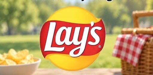
It contains a bright yellow circle, a soft red ribbon and the company’s name written in rounded white lettering.
There is no detailed photograph of a potato chip and no complicated illustration explaining what consumers will find inside the bag.
Yet the design can still suggest warmth, appetite and comfort before the package is opened.
That effect comes from the way its colors, shapes and lettering work together.
Each visual element contributes to an identity intended to feel immediately recognizable.
The logo does not need to explain itself every time someone sees it.
Its familiarity allows the design to connect with memories of snacks, family gatherings, relaxed afternoons and other ordinary moments.
The Yellow Circle Creates a Warm Center
The most noticeable element is the large yellow circle behind the brand name.
Its color can suggest sunlight, warmth and positive energy.
Yellow is also closely connected with the golden appearance of many potato chips.
The circle therefore performs several tasks without presenting a literal image.
It can resemble a sun, suggest the color of the product and create a bright focal point on the package.
The rounded shape contributes to the friendly appearance.
Circles have no sharp corners or sudden visual interruptions.
The eye can move around them easily, making the design feel softer and more approachable.
Placed at the center of the logo, the yellow circle becomes a visual source of warmth surrounding the Lay’s name.
A Sun That Also Suggests a Chip
The yellow circle does not need to represent one specific object.
Some viewers may interpret it as a glowing sun.
Others may see the suggestion of a large, round potato chip positioned behind the lettering.
That ambiguity makes the design effective.
Rather than displaying a detailed product image, the logo allows the viewer’s mind to complete the association.
The color and shape provide enough information to suggest the food without showing it directly.
This visual shortcut can encourage appetite through recognition.
The consumer already knows what a chip looks, feels and tastes like.
A golden circle can bring those memories forward without requiring a photograph.
The Red Ribbon Adds Movement
A curved red ribbon crosses the yellow center and supports the white lettering.
Red adds energy and contrast to the logo.
Against yellow, it creates a combination that is bright enough to remain visible across different package designs.
The ribbon does not move in a rigid horizontal line.
Its gentle curves make it appear flexible and active.
That movement prevents the logo from feeling static while maintaining its approachable tone.
The red element creates excitement, but the rounded shape keeps that excitement controlled.
It attracts attention without making the design appear aggressive.
The result feels more like an invitation than a command.
Why Red and Yellow Work Together
The combination of red and yellow has a strong visual presence.
Yellow supplies brightness, while red creates depth and emphasis.
Each color makes the other appear more noticeable.
The warm palette also supports the emotional message associated with the logo.
Neither color feels cold or distant.
Together, they can suggest energy, friendliness and immediate enjoyment.
The colors also remain easy to recognize from a distance.
A shopper does not necessarily need to read every letter before identifying the familiar yellow-and-red arrangement.
That rapid recognition is valuable in an environment where many competing packages appear close together.
Rounded Letters Reinforce Familiarity
The Lay’s name is presented in a soft, rounded typeface.
The lettering avoids severe angles or formal details.
Its curves echo the circular background and flowing ribbon, giving the complete logo a consistent visual language.
The letters appear casual and accessible rather than luxurious or exclusive.
That choice suits a snack intended to be enjoyed in ordinary settings.
The logo does not suggest that the product requires a special occasion.
It communicates ease.
The rounded lettering can also feel familiar because it appears less mechanical than a rigid typeface.
It supports the impression of a brand that has been part of everyday life for a long time.
White Lettering Suggests Clarity
The brand name appears in white across the red background.
This creates a clear contrast that keeps the word readable.
White can also suggest simplicity and directness.
Within the Lay’s logo, it separates the name from the stronger colors surrounding it.
The design contains enough brightness to attract attention without making the lettering difficult to understand.
That balance is important.
The decorative elements create emotion, but the brand name remains the focus.
A logo loses much of its value if consumers remember the colors but cannot identify the company.
The white lettering ensures that recognition stays connected to Lay’s.
A Design That Does Not Need a Product Photograph
The logo can suggest potato chips even when no photograph is present.
The yellow circle offers the color and basic shape, while the surrounding design supplies energy and warmth.
The viewer’s memory provides the remaining details.
A person familiar with the product can imagine the crisp texture, salty flavor and sound of opening the bag.
This process demonstrates how a logo can communicate through suggestion.
It does not need to describe the complete eating experience.
It needs only to activate associations already stored in the consumer’s mind.
The simpler image can become more flexible because it works across many products, flavors and package sizes.
Nostalgia Becomes Part of the Experience
For longtime customers, the Lay’s logo may be connected to memories extending far beyond the product itself.
A familiar package can recall childhood lunches, road trips, picnics or afternoons spent with friends.
Those associations are personal and differ from one person to another.
The consistent core of the logo helps preserve them.
When consumers encounter the same yellow circle, red ribbon and white name across many years, the image can feel connected to their own past.
The logo becomes more than an identifier.
It becomes a visual doorway into moments when the product was present.
That emotional familiarity can make a package feel reassuring even when other parts of life have changed.
The Promise of a Brief Pause
Snack foods are often associated with short breaks rather than formal meals.
A bag of chips may accompany a few quiet minutes between responsibilities, a shared conversation or an evening at home.
The Lay’s logo supports that casual experience.
Its warm colors and relaxed shapes do not demand serious attention.
They suggest something easy, familiar and immediately available.
For a tired or stressed consumer, that message can feel especially appealing.
The product offers a small interruption in the day.
The logo visually introduces that promise before the bag is opened.
Comfort Without Complication
The design does not communicate complexity.
There are no intricate symbols that require explanation and no formal imagery suggesting exclusivity.
The logo presents a straightforward pleasure through recognizable colors and shapes.
That simplicity can create a feeling of reliability.
Consumers know what the product represents and do not need to study the packaging to understand it.
The familiar appearance can feel comforting precisely because it asks so little from the viewer.
It offers recognition during moments when a person may be seeking something uncomplicated.
Consistency Across Redesigns
Major brands regularly update their visual identities.
Lettering may become cleaner, colors may be adjusted and shapes may receive a more modern appearance.
The challenge is changing enough to remain current without losing the features consumers recognize.
Across its redesigns, the Lay’s logo has retained its essential structure.
The warm yellow center, red curved element and prominent white name continue defining the brand.
That continuity protects the emotional associations created over time.
A dramatically different logo could weaken the immediate connection between the package and the consumer’s memories.
Gradual refinement allows the design to evolve while remaining unmistakably familiar.
Recognition Happens Before Conscious Analysis
Most shoppers do not stop to examine every shape within a familiar logo.
Recognition often occurs almost instantly.
The combination of colors and general outline may identify the product before the person consciously reads the name.
This is one reason maintaining core visual elements matters.
The logo operates as a complete image rather than a collection of separate design decisions.
A consumer may never consciously think about the yellow circle as sunlight or the red ribbon as movement.
The emotional effect can still occur.
The design feels warm, active and familiar even when the viewer does not analyze why.
The Logo and the Moment of Craving
A craving is not always created by physical hunger alone.
Memory, mood
The Hidden Design Psychology Behind the Familiar Lay’s Logo
Its yellow circle, flowing red ribbon and rounded white letters work together to create feelings of warmth, familiarity and simple enjoyment
The Lay’s logo is immediately recognizable, even when no bag of potato chips appears beside it.
A warm yellow circle sits behind a flowing red ribbon, while soft white letters display the brand name across the center.
The design appears cheerful and uncomplicated.
That simplicity is part of its effectiveness.
Each color, curve and visual relationship helps create an emotional impression before a customer consciously considers the product.
The logo does not need to show an actual chip to encourage thoughts of food.
Its combination of shape, color and familiarity allows the viewer’s mind to complete the association.
For many people, the image can evoke memories of childhood snacks, family gatherings, relaxed afternoons and the sound of opening a familiar bag.
The Yellow Circle Resembles the Sun
The largest visual feature is the bright yellow circle positioned behind the name.
Yellow commonly carries associations with warmth, daylight and positive energy.
In the Lay’s design, the circular shape strengthens those impressions by resembling a glowing sun.
A circle has no sharp corners or abrupt ending points.
Its continuous outline can appear balanced, approachable and complete.
When combined with yellow, it creates a visual center that feels bright without becoming complicated.
The shape may also suggest the round form of a potato chip.
No realistic food image is required because the mind can connect the circular background with the product inside the package.
The design therefore works in more than one way.
It can represent warmth and sunlight while quietly recalling the appearance of the snack itself.
Why Yellow Works for a Snack Brand
Yellow stands out quickly on shelves filled with competing packages.
It can attract attention while maintaining a friendly and familiar appearance.
For a snack intended to communicate immediate enjoyment, that balance is valuable.
The color does not require a detailed explanation.
Viewers can process it almost instantly.
The warm tone creates an impression of lightness and pleasure rather than seriousness or complexity.
It also connects visually with the golden color commonly associated with cooked potato chips.
The logo can remind people of the product without displaying an exact photograph.
This indirect suggestion allows the image to remain clean and adaptable across different packages, advertisements and sizes.
The Red Ribbon Adds Energy
A red ribbon crosses the yellow circle and carries the Lay’s name.
Red introduces energy, excitement and contrast.
Without it, the yellow circle and white lettering might appear too quiet or blend together.
The deeper color creates a strong visual anchor in the center of the design.
Its curved movement also prevents the logo from feeling rigid.
The ribbon does not resemble a hard rectangular sign.
It bends gently around the circle, creating a sense of motion while preserving the welcoming tone.
The shape appears to wrap around the yellow center rather than cover it completely.
This allows both colors to remain prominent and gives the logo a layered appearance.
Curves Feel More Inviting Than Sharp Angles
The Lay’s logo relies heavily on rounded forms.
The yellow background is circular, the red banner curves and the letters contain soft edges.
There are few harsh angles or severe geometric elements.
This creates an approachable visual personality.
Sharp lines can communicate precision, speed or intensity.
Rounded forms often feel gentler and more informal.
That distinction suits a product associated with casual moments rather than formal occasions.
The logo appears comfortable in settings such as a family kitchen, picnic, party or relaxed evening at home.
Its curves help it communicate enjoyment without looking demanding.
The White Lettering Suggests Simplicity
The brand name appears in clean white lettering across the red ribbon.
White provides strong contrast and keeps the word easy to read.
It also introduces a sense of simplicity and openness.
The letters do not appear overly technical or formal.
Their rounded style complements the rest of the logo and helps the name feel friendly.
A more severe typeface could make the design look distant or highly corporate.
The chosen lettering feels conversational and familiar.
It communicates the impression of a product that does not require special knowledge or preparation.
The message is immediate: this is a recognizable snack designed to be opened and enjoyed.
The Mind Supplies the Missing Product
One of the logo’s most effective qualities is what it leaves out.
It does not need to display a detailed potato, cooking process or individual chip.
The visual associations are already strong enough for customers to imagine the product.
The yellow circle may suggest a chip, while the warm color recalls its familiar golden surface.
The red ribbon and bold name complete the connection.
Repeated exposure strengthens that process.
After seeing the logo on packages and advertisements over many years, viewers can recognize it from a distance.
The brain fills in the taste, texture and sound associated with the snack.
A simple symbol can therefore produce a complete product memory.
Familiarity Builds Emotional Meaning
A logo acquires meaning through repeated experience.
The shapes and colors alone do not contain personal memories.
Those memories develop as people encounter the brand during different parts of their lives.
A person may associate Lay’s with lunch during childhood, snacks shared with friends or food placed on the table during family events.
Another person may connect the logo with road trips, summer afternoons or quiet evenings in front of the television.
Over time, the design becomes linked to those experiences.
Seeing the yellow circle and red ribbon can reactivate feelings surrounding the moments in which the product appeared.
The logo becomes familiar not only because it is repeatedly advertised but because it accompanies everyday life.
Nostalgia Can Influence Appetite
Hunger is not always triggered only by an immediate physical need for food.
Memory, mood and surroundings can also influence the desire to eat.
A familiar snack logo may remind someone of a pleasant experience and create interest in repeating it.
The Lay’s design supports that response through warm colors and recognizable shapes.
It does not present a complicated promise.
It suggests a small, accessible moment of enjoyment.
For someone experiencing stress or fatigue, that simplicity may feel appealing.
The product represents something predictable at a time when other parts of the day may feel uncertain.
The emotional association can become nearly as important as the flavor itself.
Comfort Without Complexity
Snack packaging often communicates immediate satisfaction.
The Lay’s logo contributes to that idea by remaining visually uncomplicated.
There is no dense imagery requiring careful study.
The bright circle, red ribbon and white name can be understood in a fraction of a second.
That speed matters in environments where many products compete for attention.
A customer may scan an entire shelf without consciously examining every package.
A familiar design makes the choice feel easier.
The logo reassures the viewer that the product inside is known and predictable.
That feeling can reduce hesitation and encourage an almost automatic decision.
Recognition Across Different Packages
A successful food logo must function across numerous flavors and package designs.
The surrounding colors may change, and photographs of ingredients can vary dramatically.
The central brand mark must remain recognizable.
Lay’s maintains the yellow circle, red ribbon and white lettering as a consistent visual foundation.
This allows customers to recognize the brand even when the rest of the package is unfamiliar.
A new flavor can use different colors without losing its connection to the main product family.
The logo acts as a stable point inside an evolving design system.
That consistency protects familiarity while allowing variety.
Red and Yellow Create Strong Contrast
Red and yellow are both visually prominent colors.
When placed together, they create a combination that can be noticed quickly.
The yellow circle provides brightness, while the red ribbon gives the design depth and definition.
The white letters remain clearly readable against the darker red background.
Each component supports the others.
If the name were placed directly over yellow, it might lose visibility.
If the entire design were red, it could appear heavier and less connected to the golden snack.
The current arrangement creates a hierarchy that guides the eye from the bright outer circle to the central ribbon and finally to the name.
A Logo Designed to Feel Timeless
The Lay’s logo has changed across different periods, but its central emotional character has remained recognizable.
Design updates can modernize proportions, colors and lettering without abandoning the basic identity customers remember.
This continuity is important for an established brand.
A completely unfamiliar logo could weaken decades of recognition.
Maintaining the core combination allows the design to evolve while preserving its relationship with longtime customers.
People can encounter a newer version and still understand immediately what it represents.
The brand appears current without losing the familiarity associated with earlier experiences.
The Logo as a Visual Promise
Every brand symbol makes an implicit promise about the experience attached to it.
The Lay’s logo suggests that opening the bag will produce something familiar, simple and enjoyable.
The bright yellow communicates warmth.
The red ribbon adds excitement, while the white lettering keeps the identity clear and uncomplicated.
Together, those elements imply a brief pause from the demands of the day.
The promise is modest rather than transformative.
It offers the small pleasure of a familiar flavor and crisp texture.
That limited promise can feel believable because it does not ask the product to represent anything more complicated than a snack.
Design Can Affect a Decision Before Words Do
People do not always analyze why a package attracts them.
Visual information can be processed before someone consciously describes the colors or shapes involved.
A familiar yellow circle may be recognized instantly, long before the customer reads the brand name.
The emotional response can happen just as quickly.
Warmth, nostalgia and appetite may appear as one combined impression.
This does not mean a logo controls every purchasing decision.
Price, preference, availability and dietary choices still matter.
It means visual design contributes to the environment in which the decision is made.
The Lay’s logo has been refined to make that contribution clear and consistent.
The Difference Between Invitation and Pressure
The design’s curved forms help it feel inviting rather than forceful.
The red ribbon adds energy, but its soft motion prevents the color from becoming visually aggressive.
The yellow center attracts attention without creating a complicated or dramatic image.
The lettering does not command the viewer through severe typography.
It presents the name in a friendly style that feels established and accessible.
The complete logo therefore suggests enjoyment rather than demanding it.
This subtlety fits a product often selected during casual, low-pressure moments.
The Role of Childhood Associations
Brands encountered early in life can become connected to powerful memories.
A familiar snack may recall school lunches, birthday celebrations or time spent with relatives.
The Lay’s logo can become part of those scenes without being their central focus.
Years later, seeing it may bring back the emotional atmosphere surrounding them.
The response is not necessarily a detailed memory.
It may appear simply as comfort, familiarity or the sense that the product has always been present.
The logo’s consistent colors and shapes help preserve that connection across time.
A Small Escape in a Familiar Package
The strongest message in the Lay’s design is not luxury or exclusivity.
It is accessibility.
The logo suggests a familiar pleasure available without ceremony.
Opening the bag creates a short interruption in the day rather than a major event.
That small pause can carry emotional importance.
People often reach for familiar food during moments of stress, celebration, boredom or relaxation.
The logo becomes associated with the transition between the pressure of the day and a brief moment of personal enjoyment.
The Quiet Power of the Lay’s Logo
The yellow circle is more than a bright background.
It can suggest sunlight, warmth and the golden appearance of a potato chip.
The red ribbon provides energy while its curved shape remains welcoming.
The rounded white letters create clarity and familiarity.
No single element explains the logo’s effectiveness on its own.
Its power comes from how the pieces work together and how frequently people have encountered them during ordinary life.
The mind connects the image with flavor, texture and personal memory before the bag is opened.
Across different redesigns, the central feeling has remained consistent.
The logo offers a visual promise of a familiar snack and a brief, uncomplicated pleasure.
That is why the design can produce a response extending far beyond recognition.
For many people, the yellow circle and red ribbon do not simply identify potato chips.
They open a small doorway to comfort, nostalgia and the anticipated joy of the first crisp bite.