
The Familiar Coca-Cola Logo and the Hidden Power Behind Its Design
The Hidden Psychology Behind Coca-Cola’s Famous Logo
For more than a century, the Coca-Cola logo has been one of the most recognizable pieces of branding in the world.
It has appeared on bottles, cans, signs, vending machines, billboards, restaurant menus, sports events, holiday campaigns, and small shops across continents.
Billions of people have seen it so often that it can feel almost invisible, not because it is weak, but because it has become part of everyday life.
A Design Seen by Generations
The logo’s power comes from the fact that it does not need to be explained.
A flash of red, a sweep of white script, and the mind immediately connects the image to Coca-Cola.
That instant recognition did not happen by accident, and it did not appear overnight.
The design began in 1886, when bookkeeper Frank Mason Robinson selected the flowing Spencerian script that would become closely tied to the brand’s identity.
At the time, the choice was practical as much as creative.
The script looked refined, elegant, and suitable for ledgers, written records, and public signage.
It gave the name a polished appearance at a moment when a strong written identity could help a product stand apart.
The Origins of the Script
Spencerian script was known for its graceful movement, smooth curves, and handwritten quality.
For Coca-Cola, that style helped the name feel personal rather than mechanical.
Instead of appearing cold or overly commercial, the lettering suggested care, familiarity, and a human touch.
That handwritten feeling became one of the logo’s most important emotional signals.
Even as the brand grew far beyond its early setting, the script continued to carry that sense of personal connection.
The letters did more than spell out a product name.
They created a visual personality that felt warm, confident, and memorable.
How the Logo Changed Over Time
Although the basic character of the Coca-Cola logo remained consistent, the design was refined as the brand expanded.
The curves became more deliberate, the spacing more controlled, and the white stroke more carefully balanced against the red background.
These refinements helped make the logo stronger across different formats.
It needed to work on glass bottles, printed signs, packaging, advertising materials, and later on screens and digital platforms.
That consistency gave Coca-Cola a major advantage.
People could recognize the brand whether they saw it up close on a bottle or from a distance on a large sign.
The logo became less like a label and more like a symbol.
The Role of the Red Background
The red color associated with Coca-Cola became one of the most powerful parts of the brand’s visual identity.
Red is bold, urgent, energetic, and difficult to ignore.
In the context of food and drink branding, it can also suggest appetite, excitement, pleasure, and movement.
When paired with the flowing white script, the red field gives the logo a clear emotional charge.
The design feels active without needing animation.
It draws attention even in crowded spaces where many other products compete for the eye.
That visual strength helps explain why the logo has remained effective across generations.
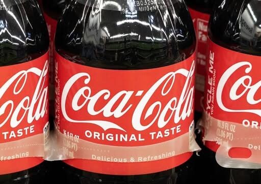
The White Script Against Red
The contrast between the white lettering and the red background is central to the logo’s impact.
The white script appears clean and smooth, while the red background gives it force and visibility.
Together, they create a balance between softness and energy.
The handwritten style feels approachable, while the red setting makes the design impossible to overlook.
This combination allows the logo to communicate more than a brand name.
It suggests trust, excitement, familiarity, and enjoyment in a single visual moment.
That is why the design can be understood even when no advertisement or slogan appears beside it.
The Idea of a Hidden Message
Recent discussion about the Coca-Cola logo has focused on the idea that something may be hidden inside the famous design.
The claim is not that the letters contain a secret picture or concealed code.
The more persuasive idea is that the logo’s hidden message is emotional rather than literal.
Its design speaks to the mind through shape, color, rhythm, and memory.
The curves guide the eye smoothly across the name.
The handwritten appearance makes the brand feel personal.
The red color adds intensity and appetite.
None of these elements need to be spoken aloud to be felt.
Emotional Engineering Through Design
Branding experts have argued that the logo works because it quietly influences feeling.
It does not need to command people directly.
Instead, it builds associations over time.
Every repeated encounter strengthens the link between the design and certain emotions.
A person may see the logo during a meal, at a celebration, on a hot day, near a sports event, or during a holiday advertisement.
Over years, those moments attach themselves to the image.
The logo then becomes a shortcut to memory.
Why Familiarity Matters
One of the most important forces behind the Coca-Cola logo is repetition.
People have seen the same core design again and again, often in positive or social settings.
That steady exposure makes the logo feel familiar even before a person thinks about the product itself.
Familiarity can create comfort.
Comfort can create trust.
Trust can make a brand feel reliable, even when the viewer is not consciously analyzing the design.
This is part of the reason the logo continues to feel powerful after more than a century.
A Symbol Beyond the Product
As Coca-Cola spread around the world, its logo became more than a marker for a soft drink.
It came to represent shared moments, nostalgia, and a certain image of Americana.
That emotional meaning could appear in many different places.
It might be seen on a roadside stall, a city billboard, a restaurant cooler, or a bright sign in a busy square.
The setting could change completely, but the feeling created by the design remained consistent.
This is one reason the logo has traveled so successfully across cultures and markets.
The Power of Not Changing Too Much
Many brands change their visual identity repeatedly in an effort to look modern.
Coca-Cola’s logo shows the opposite strength.
Its most important features have remained recognizable, even as the design has been refined.
That stability helped build long-term memory.
People who saw the logo decades ago can still recognize it today.
Parents, children, and grandparents may all connect the same script with different personal memories.
That shared recognition gives the brand a rare kind of continuity.
Why the Curves Matter
The curves in the Coca-Cola script are part of the reason the logo feels so smooth and inviting.
The letters do not appear sharp, cold, or aggressive.
They flow into one another with movement that feels almost ribbon-like.
This creates a sense of ease.
The eye follows the line naturally, moving through the name without resistance.
That visual softness helps balance the intensity of the red background.
The result is a logo that feels lively but not harsh.
The Real Secret in Plain Sight
The real secret of the Coca-Cola logo may be that it never had to hide anything at all.
Its influence is visible in every curve, every contrast, and every repeated appearance.
The design works because it is simple enough to remember and emotional enough to last.
It does not rely on complicated symbolism.
It relies on consistent feeling.
Over time, that feeling becomes automatic.
A person sees the logo and may immediately think of refreshment, habit, nostalgia, celebration, or comfort.
A Logo That Speaks Without Words
The Coca-Cola name is written directly in the logo, but the design communicates far beyond the letters.
It speaks through color, shape, memory, and repetition.
Its message is not hidden inside a secret mark.
It is built into the way the design makes people feel before they stop to think.
That is what makes the logo so effective.
It can cross language barriers because its strongest signals are visual and emotional.
Even without a slogan, the logo can still carry meaning.
Why It Still Works Today
The Coca-Cola logo continues to stand out because it has become deeply embedded in public memory.
Its design is not only seen; it is remembered.
The red field creates instant attention, while the white script brings familiarity and warmth.
The combination has allowed the logo to survive changes in advertising, packaging, media, and consumer habits.
Its strength comes from being both old and constantly present.
It feels historic without feeling absent from modern life.
That balance is difficult for any brand to achieve.
The Lasting Lesson of the Coca-Cola Logo
The story of the Coca-Cola logo is a reminder that powerful design does not always announce its power loudly.
Sometimes it works quietly, through repetition, emotion, and recognition.
What began in 1886 as a practical choice by Frank Mason Robinson became one of the most enduring visual identities in the world.
The flowing Spencerian script gave the brand elegance and personality.
The red background added energy and appetite.
The consistent use of both turned the logo into an emotional shortcut recognized across the globe.
The familiar red smile has not needed a secret symbol to shape perception.
Its real message has been in plain sight all along.