
The Small Design Detail Hidden in the 7-Eleven Logo
The Hidden Lowercase Letter That Makes the 7-Eleven Logo So Memorable
The 7-Eleven logo is one of the most familiar retail symbols in the world. Its bold mix of red, orange, and green has appeared on storefronts in cities, suburbs, and roadside locations across countless countries.
At a quick glance, the logo looks simple and direct. The large number, strong colors, and clear lettering make it easy to recognize from a distance.
But a closer look reveals a small detail that many people miss. In the word Eleven, the final letter is lowercase, while the rest of the word appears in an uppercase style.
That unusual choice has led many people to wonder whether it was a mistake, a hidden message, or an old design error that was never corrected. The answer is much simpler, but it also shows how much thought can go into even the smallest part of a brand identity.
How 7-Eleven Began
The story of 7-Eleven began in 1927 in Dallas, Texas. Long before the company became known by its current name, it operated as Tote’m Stores.
The early business idea focused on convenience. Customers could visit one location and carry away everyday items such as milk, bread, and eggs without needing to stop at several separate shops.
That approach was practical and forward-thinking for its time. Shopping was often less centralized, and the idea of making common household goods easier to access helped shape the foundation of the brand.
The name Tote’m reflected the basic concept behind the stores. Customers could tote their purchases away from a single convenient location.
Even in its earliest years, the company was built around accessibility and simplicity. Those values would later become central to the identity of 7-Eleven as it expanded far beyond its original local roots.
The Name That Came From Store Hours
In 1946, the company changed its name to 7-Eleven. The new name was created to highlight the extended operating hours that made the stores stand out from many other retail businesses of the period.
At that time, most grocery and retail stores closed much earlier in the evening. 7-Eleven locations were open from 7 a.m. to 11 p.m., giving customers more time to shop during the day and evening.
This schedule was unusual enough to become a major selling point. The name did not simply identify the company; it communicated the promise of greater convenience.
For customers, the longer hours meant more flexibility. A person who needed groceries, basic household items, or everyday essentials had a wider window to visit the store.
The rebrand helped connect the company’s name directly to its customer experience. 7-Eleven became associated with availability, reliability, and quick access.
Building a Logo People Would Remember
After the name changed, the company needed a visual identity that could work clearly on storefronts and signs. The logo had to be easy to read, easy to remember, and visible in busy surroundings.
The number 7 became the central design element. It was large, bold, and immediately connected to the new name.
The word Eleven completed the identity and gave the logo a balanced structure. Together, the number and the word created a clear connection to the store hours that had inspired the name.
Color also played an important role. The red, orange, and green combination made the logo stand out in crowded streets, shopping areas, and roadside locations.
For a convenience store, visibility mattered. Customers often made quick decisions, and a bright, recognizable sign could attract attention from a distance.
Over time, this consistent visual style helped 7-Eleven become easy to identify across many different markets. The logo’s strength came from its simplicity, but also from the care behind its design.
The Move Toward 24-Hour Service
Today, many people connect 7-Eleven with stores that are open all day and all night. However, the company did not begin with 24-hour service as its standard model.
The shift toward round-the-clock operation began in the early 1960s. A key moment happened in Austin, Texas, during a busy football weekend.
Customer demand was unusually high, and one store stayed open beyond its normal schedule. The decision proved successful because shoppers responded positively to the added convenience.
The longer hours also brought stronger sales and showed that customers valued access outside the traditional retail schedule. This encouraged more locations to experiment with extended operating times.
As more stores adopted longer hours, 24-hour service became closely linked with the company’s public identity. The idea of being available whenever customers needed something became part of the brand’s appeal.
Even after this operational change, the company kept the 7-Eleven name. By then, the name had already become familiar and valuable, so changing it was unnecessary.
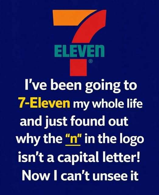
Why the Final Letter Is Lowercase
The most curious part of the logo is the final letter in Eleven. While the rest of the word appears in uppercase style, the last n is lowercase.
Earlier versions of the logo reportedly used all capital letters. That version was strong and direct, but it was also seen as somewhat rigid and visually heavy.
The change came through a simple design suggestion connected to then-president Joe C. Thompson Jr. His wife reportedly recommended making the final letter lowercase to soften the overall appearance of the logo.
That small adjustment changed the feeling of the wordmark. Instead of appearing completely stiff or forceful, the lettering became slightly more approachable.
The lowercase n was not meant to suggest a secret meaning. It was not added as a hidden symbol or coded message.
Its purpose was visual. The change helped make the logo feel friendlier while still keeping the strong recognition and clarity the brand needed.
A Small Letter With a Big Branding Role
The lowercase n is a useful example of how tiny design choices can affect the way people respond to a brand. Typography can influence mood, tone, and personality even when viewers do not consciously notice every detail.
A word written entirely in uppercase letters can feel bold and authoritative. That can be effective, but it can also appear strict or harsh depending on the design.
By changing only one letter, the 7-Eleven logo gained a softer visual rhythm. The word still looked clear, but it no longer felt as severe.
This balance was important for a convenience store brand. The logo needed to catch attention quickly, but it also needed to feel welcoming to everyday customers.
The final lowercase n helped support that balance. It made the design slightly warmer without weakening the overall identity.
Why the Detail Still Stands Out
Many customers may pass a 7-Eleven sign hundreds of times without noticing the lowercase n. Once the detail is pointed out, however, it becomes difficult to ignore.
That is part of what makes the logo interesting. A small design decision has remained visible for generations while blending naturally into the brand’s familiar appearance.
The detail also reflects how long-lasting branding often depends on consistency. 7-Eleven has made minor updates over the decades, but the main structure of the logo has remained recognizable.
The large 7, the bold colors, and the simple wordmark continue to define the company’s visual identity. These elements help customers identify the store quickly in many different places.
Consistency builds recognition. When people see the sign, they know what kind of store it represents and what type of convenience they can expect.
More Than a Convenience Store Sign
The 7-Eleven logo represents more than a retail chain. It reflects the company’s long development from a small convenience idea in Dallas to a widely recognized global brand.
The original Tote’m Stores focused on practical access to everyday goods. The later 7-Eleven name highlighted extended hours and a new level of customer convenience.
The movement toward 24-hour service strengthened that identity even further. The brand became associated with being available when customers needed it most.
The logo carries that history in a simple visual form. Its colors, lettering, and structure all support the idea of a store that is easy to find and easy to use.
Even the lowercase n plays a role in that larger identity. It shows that a brand does not always need a dramatic change to become more effective.
Final Thoughts
The story behind the 7-Eleven logo shows how branding can be shaped by small but deliberate choices. What may look like an odd mistake is actually part of a thoughtful design decision.
The lowercase n was added to make the logo appear softer and more approachable. It did not change the meaning of the name, but it changed the feeling of the design.
From its beginning as Tote’m Stores in 1927 to its 1946 rebrand and later move toward 24-hour service, 7-Eleven has built its identity around convenience and accessibility.
The logo continues to communicate those values through a design that is bright, simple, and easy to recognize. Its most unusual detail is also one of its most memorable.
In the end, the lowercase n proves that even the smallest part of a logo can become a lasting piece of brand history.