
Four Colored Racing Lines Turn One Simple Corner Into a Huge Online Debate
One Corner, Four Lines, Endless Arguments
A simple drawing of a race track corner has managed to create the kind of argument usually reserved for far more complicated questions.
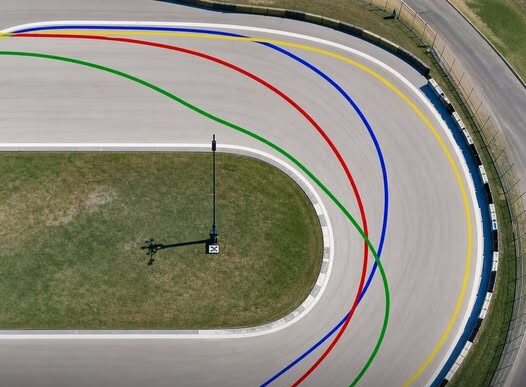
The image shows four colored lines — blue, green, yellow and red — each taking a different path through the same bend.
At first, it looks like a basic driving puzzle.
Then the debate begins.
Some viewers insist one line is clearly the fastest. Others immediately reject that answer and defend a completely different approach.
Before long, the discussion stops being about a few colored lines and turns into a larger argument about braking, apexes, cornering speed and what actually makes someone a skilled driver.
Why Such a Simple Image Became So Controversial
The appeal of the diagram is its simplicity.
There are no complicated calculations, telemetry screens or detailed descriptions of the car.
There is only a corner and four possible paths through it.
That leaves plenty of room for interpretation.
Each viewer can look at the image and immediately imagine how the car would approach the bend, where it would brake, when it would turn and how quickly it could accelerate afterward.
The problem is that those assumptions are often different.
That is why two people can look at the same picture and feel equally certain that the other person is wrong.
The Yellow Line Represents a Wide, Sweeping Approach
The yellow path appears to favor a broad entry into the corner.
It carries the car wide before guiding it through the bend in a smooth arc.
Supporters of this style may see it as a way to maintain momentum and avoid abrupt steering movements.
The appeal is easy to understand.
A wider line can look controlled, smooth and committed.
It suggests that the driver is thinking about maintaining speed rather than attacking the corner with sudden movements.
For some people, that feels like the most natural racing approach.
Others look at the same line and argue that it may sacrifice something elsewhere, particularly if the next part of the track demands a different exit.
The Blue Line Looks Like a More Traditional Racing Choice
The blue line is often interpreted as a more conventional racing approach.
It appears to use the width of the track before aiming toward a defined point near the inside of the corner.
That creates the familiar idea of entering wide, moving toward the apex and then allowing the car to open its steering as it exits.
For many viewers, this looks immediately correct because it resembles the classic racing line people are taught to imagine.
It appears deliberate and precise.
The driver seems to sacrifice some distance before the turn in exchange for a cleaner path through it.
But even this apparently traditional answer is not automatically perfect in every situation.
The Green Line Looks Aggressive
The green path takes a noticeably different approach.
It appears to move more directly toward the inside of the corner.
That makes it look aggressive, almost as though the driver is attacking the bend rather than flowing through it.
Some people may associate this kind of line with a late move, a hard braking zone or an attempt to gain position.
It can look exciting because it gives the impression of commitment.
But an aggressive entry does not automatically mean a faster overall result.
A line that works well for overtaking can be different from the line that produces the fastest possible lap in clean air.
That distinction is often lost once the online argument begins.
The Red Line Represents Compromise
The red path appears less extreme than some of the others.
Rather than making the widest possible approach or diving sharply toward the inside, it looks like a compromise between several goals.
That can make it seem less dramatic.
Yet compromise can be important in racing.
A driver is not always trying to optimize one isolated corner.
The position of the next bend, the need to defend from another car or the amount of available grip can all influence the route taken through a turn.
A line that looks imperfect in a single image might make more sense when viewed as part of an entire lap.
The Missing Information Is What Makes the Puzzle Work
One reason the argument becomes so intense is that the diagram leaves out many of the details needed to identify one universally correct answer.
The type of car is unknown.
The amount of grip is unknown.
The condition of the tires is unknown.
The direction and shape of the next corner are unknown.
Even the exact objective is not clearly defined.
Is the driver trying to produce the fastest qualifying lap?
Are they defending a position?
Are they attempting an overtake?
Are they trying to protect the tires?
Without that context, the colored lines become less of a technical test and more of an invitation to argue.
There Is More Than One Way to Take a Corner
In real driving, racing lines depend heavily on circumstances.
A driver may take one route through a corner during qualifying and another while fighting another car.
Wet conditions may require a completely different approach from dry conditions.
A high-powered car may prioritize its exit differently from a slower car that depends more heavily on carrying momentum.
A driver may even intentionally sacrifice one corner to improve the next one.
That is why the idea that one colored line must always be correct oversimplifies the situation.
Entry Speed Is Only Part of the Equation
Many online arguments focus heavily on how quickly the car enters the corner.
But carrying maximum speed into a bend is not necessarily the same as producing the best overall result.
If the car enters too quickly, the driver may be forced into a slower or wider exit.
That can delay acceleration and cost time afterward.
In other situations, sacrificing some entry speed can allow the driver to straighten the car earlier and accelerate more effectively.
The fastest route therefore depends on more than what happens at the beginning of the turn.
The Apex Is Another Major Source of Debate
The apex is one of the most frequently discussed ideas whenever racing lines are compared.
Drivers do not always aim for exactly the same point on the inside of a corner.
An earlier apex can create one shape through the bend, while a later apex can create another.
Choosing between them depends on what the driver is trying to achieve.
A later apex can sometimes support a stronger exit because the car is positioned differently as it begins to accelerate.
An earlier approach may work better in other situations.
The four colored lines appear to represent some of those competing ideas.
Braking Changes the Entire Picture
The diagram does not show exactly where each imaginary driver begins braking.
That matters enormously.
A driver who brakes earlier may be able to position the car more smoothly before turning.
Another may brake later and carry more speed into the same area.
Neither strategy can be judged properly by looking only at the path drawn on the track.
Braking technique, steering input and throttle application all interact with the racing line.
The colored path is only one part of the complete sequence.
The Car Itself Can Change the Best Line
Different cars behave differently in corners.
Some may change direction quickly and tolerate aggressive steering inputs.
Others may perform better when driven smoothly.
The balance between braking performance, cornering grip and acceleration can influence which route is most effective.
A line that suits one vehicle may not be ideal for another.
That makes confident declarations based on a generic drawing even more difficult to defend.
Grip Can Completely Rewrite the Answer
Track conditions also matter.
A line that works on a dry surface may not be the best choice when the track is wet or dirty.
Different parts of the road can offer different levels of traction.
Drivers may deliberately avoid the most obvious path if grip is better somewhere else.
This again shows why a racing line cannot always be separated from its environment.
The diagram may look like a question with one correct answer, but real driving rarely works that way.
The Next Corner May Matter More Than This One
Another major factor missing from the drawing is what comes immediately afterward.
A racing driver does not necessarily optimize every turn individually.
If one corner leads directly into another, the first may be approached in a way that creates a better position for the second.
That can make a line appear slower or less elegant when viewed by itself.
Across an entire sequence, however, it may be the better choice.
This is why the quickest line through one isolated bend is not always the fastest route through an entire section of track.
Why People Take the Debate Personally
The strongest part of the viral discussion is not really technical.
It is psychological.
People are not simply selecting blue, green, yellow or red.
They are defending the kind of driver they believe they would be.
Someone who chooses the aggressive line may see themselves as brave and decisive.
Someone who prefers the smoother route may identify with precision and control.
Another viewer may value strategy and choose the line that appears to offer the best exit.
The debate quickly becomes attached to identity.
Every Color Suggests a Different Philosophy
That is what makes the tiny drawing more interesting than it first appears.
The yellow line suggests commitment to a broad, flowing path.
The blue line evokes the idea of traditional racing precision.
The green line looks aggressive and direct.
The red line appears to balance competing priorities.
Those differences make each option easy to defend.
Once someone chooses one, they can build an entire explanation around why their approach reflects proper driving.
Famous Circuits Help Fuel the Fantasy
Part of the appeal also comes from the way people imagine themselves in famous racing environments.
A simple corner can evoke thoughts of Le Mans, Monaco or the Nürburgring.
Viewers mentally replace the plain diagram with real barriers, curbs, braking markers and high-speed competition.
The exercise becomes more than solving a puzzle.
It becomes a miniature racing fantasy.
For a few moments, anyone looking at the drawing can imagine deciding where to brake and when to turn while driving at the limit.
The Internet Rewards Certainty
Nuance rarely produces the loudest argument online.
A careful answer such as “it depends” may be more realistic, but it is less satisfying than declaring one color clearly superior.
That encourages people to defend absolute positions.
Blue must be right.
Yellow must be faster.
Green is the only brave choice.
Red is the smartest compromise.
The simpler the claim, the easier it becomes to repeat and defend.
The Real Answer Depends on Context
In practice, the best racing line depends on the circumstances surrounding the corner.
The car matters.
The available grip matters.
The braking point matters.
The next section of track matters.
The driver’s objective matters.
A qualifying lap can demand one approach while wheel-to-wheel racing demands another.
That means a single static diagram cannot completely settle the question.
The Picture Reveals More Than Driving Knowledge
The viral image may appear to test racing expertise, but its larger appeal comes from something else.
It gives people an opportunity to reveal how they think about driving.
Do they value smoothness?
Do they admire aggression?
Do they prioritize exit speed?
Do they think in terms of the entire sequence rather than one turn?
Those preferences become visible in the answer they defend.
Four Lines Became a Test of Identity
That is why such a small sketch created such a large reaction.
The colors became symbols for different ideas about skill, confidence and technique.
The arguments were no longer only about geometry.
They became arguments about who truly understands racing.
And once pride enters the discussion, changing someone’s mind becomes much harder.
So Which Line Is Correct?
The most accurate answer is that there is no universally correct color without additional information.
Each path represents a different approach, and each could make sense under particular conditions.
The fastest route through a real corner depends on factors the drawing does not provide.
That uncertainty is exactly what makes the image so effective.
It looks like a simple test with one obvious answer.
Instead, it becomes a reminder that racing is built on compromises between braking, grip, speed, positioning and what comes next.
The blue, green, yellow and red lines may never produce universal agreement.
But perhaps that is why one tiny corner has managed to keep so many people arguing.